
Following your feedback, we've brought the strongest elements of the four explorations into two refined directions — and built each one out as a complete site: homepage, The Watch, Technology, Story, Journal and article, Contact and Legal. Same story, same facts, two different atmospheres. Both lead with privacy, widen the craft story, hold motion and the blue accent right back, and reinforce Two systems. One object. The four original explorations remain below for reference.
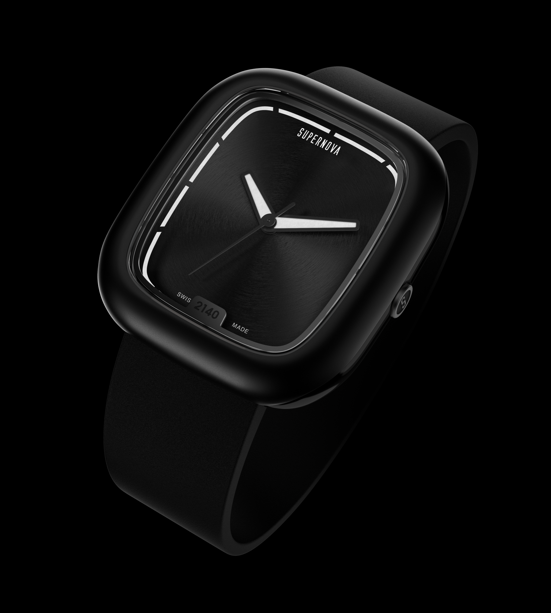
The watch held in a pool of light — calm, symmetric, product-led. Full-bleed moments and large image-led craft sections.
Enter Direction A →
Photography leads. Full-bleed imagery, one idea per screen and a single line of type — the most visual silence of the two.
Enter Direction B →Each direction is a full site. Use the navigation inside — The Watch · Technology · Story · Journal · Contact — to move through the pages. Commerce pages (configurator, pre-order and checkout) are not part of this round. Imagery is placeholder renders and mood photography until the final shoot lands.
The purest expression of the charte graphique. Enormous headline type over a ghosted watch dissolving into black, punctuated by two white "gasp" sections that make the darkness feel deliberate.
Signature: the specification laid out as an engineering technical drawing, with monospace leader-line callouts.
View Option 1 →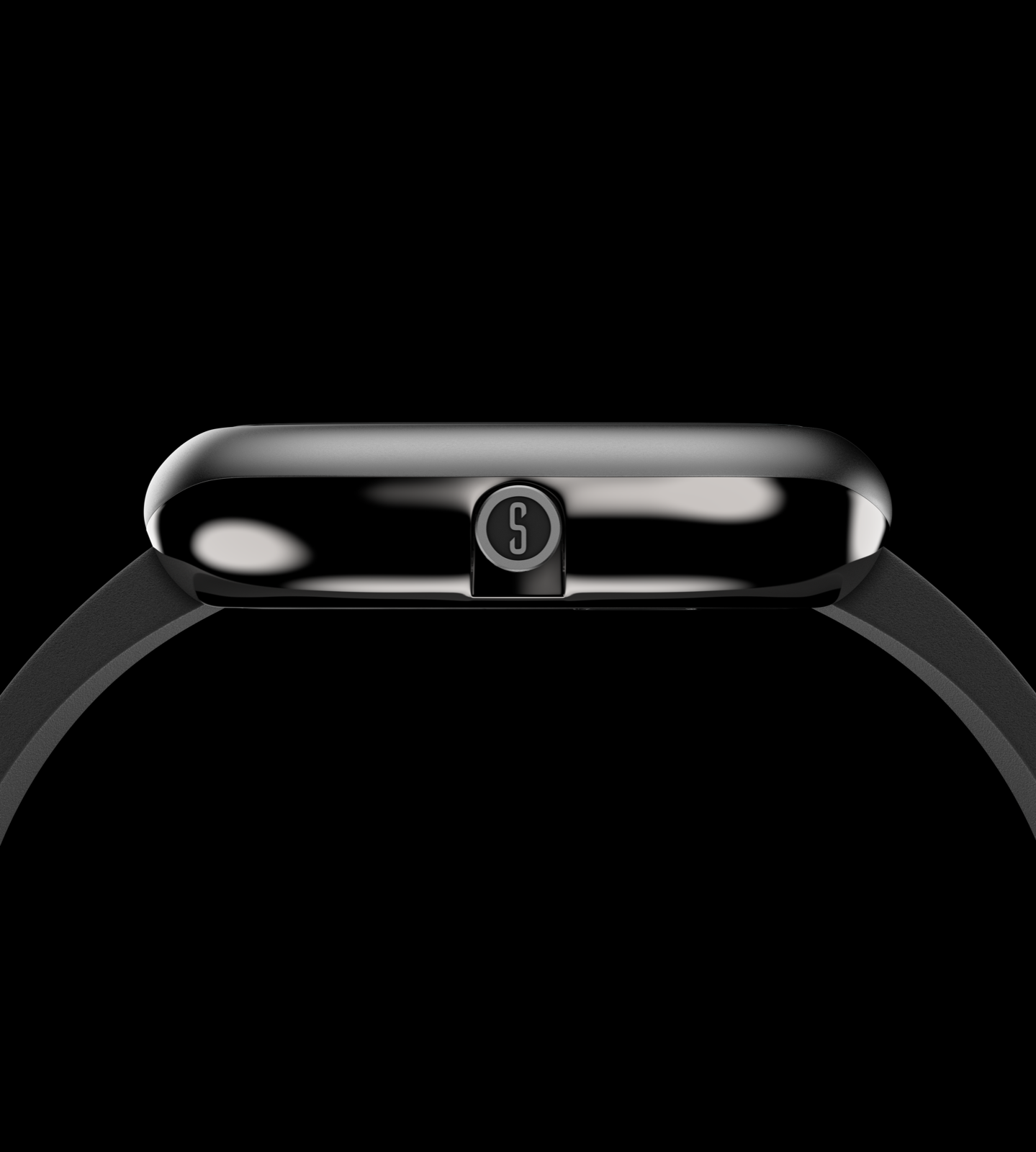
The most brand-led and least product-heavy. Numbered chapters (01–05) that read like a manifesto, oversized ghost numerals as graphic furniture, and a thin travelling "horizon" thread down the edge.
Signature: the only option with a dedicated founders section — Julien & Nuno, "two paths, one conviction."
View Option 2 →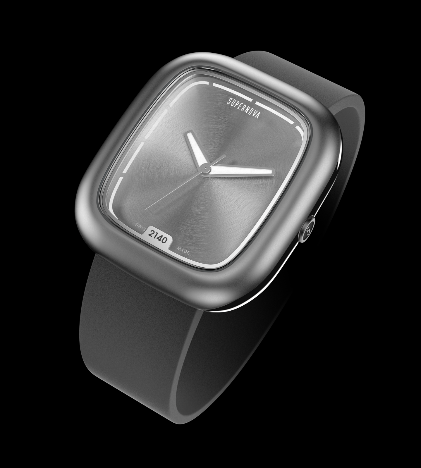
The most cinematic. The watch sits centre-stage and transforms — black PVD → natural titanium → lit markers — as short copy panels pass it. One object, seen from every angle.
Signature: the watch morphing across its finishes down the scroll — the most "show, don't tell" of the four.
View Option 3 →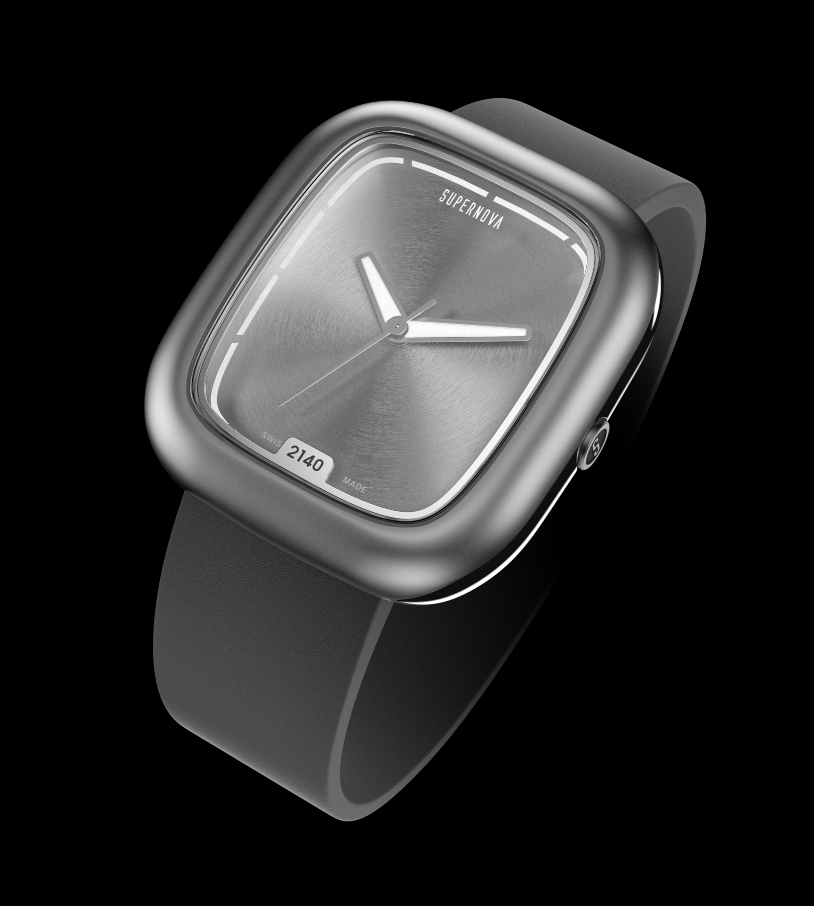
The fullest, most complete storefront. Opens on a quiet-luxury hero — the watch alone in a pool of light — then walks the whole story end to end, from framework to finite availability.
Signature: a serif grace-note hero, and the only route that tells the whole story including the payment capability.
View Option 4 →The four original explorations. These are the first-round directions that informed the two complete sites above — kept here for reference. Same brand, same specs, same sequencing; the difference is emphasis, not accuracy. Renders are placeholder-only until final photography.